Monday, 28 April 2014

Evaluation: Question 3

Blog 55: 
Question 3 is: 
What kind of media institution might distribute your media product and why?

My notes for this question are: 
o   IPC Media consumer magazine and digital publisher in the United Kingdom, with a large portfolio selling over 350 million copies each year. UK's leading consumer magazine and digital publisher. Almost two thirds of UK women and over 40% of UK men. Websites reahes over 25 million global users every month. Publish NME (Style model) + Time Inc.(owned by Time Warner) is Parent company -It publishes 130 magazines 

Evaluation: Question 2

Blog 54:
Question 2 is: How does your media product represent particular social groups?

My notes for answering this question are: 


I think the two main social groups that I have represented in my magazine is Teenagers and young adults (from around 14-25), and the indie genre.

The stereotypes of the ‘indie’ group are:
o   The ‘indie’ group- dedicated to music, fashion consious and like to shop at vintage shops, enjoy festivals and gigs, are laid back and fun loving, are environmentally friendly and their style is edgy (often sporting the messy hair look and mis-matched clothing), confident in themselves
The stereotypes of teenagers and young people are:
o   Age = teens- rebellious, youthful, want to have fun, fashion conscious

As part of my research I conducted questionnaire which helped a lot in the creation of a magazine which is suitable for the target audience

Represented in Mag
- Front- festival, edgy style, messy hair + feathers (hilly), laidback (outdoors), vintage (Polaroid’s), environmentally friendly (outdoors)
-Contents- edgy style (different shaped boxes, Hilly’s awkward pose, font), festivals + gigs (gig reviews and festival section), laid back + fun (Amy & cath laughing, editor’s note style of writing), environmentally friendly (hilly and Hannah)
-DPS- edgy (Hilly’s hair, expression, leaf, polaroid’s on slant, font in different colours, article content, other images), festivals (mentioned in article), confident (small picture of hilly on steps), environmentally friendly (outdoors, nature, leaf, meditation-suggests Buddhist?), dedicated to music (new album).
o   Gender = both (say about hilly-edgy, cath & amy- feminine, Hannah-relatable, Josh)


Compare to other photos of the genre. 
      

Sunday, 27 April 2014

Evaluation: Question 1

Blog 53: 
Question 1 of the evaluation is:
  How does the product use forms and conventions of real media products? 
I have made notes on how I will answer this question for my evaluation video. 
Notes: 


  o   Front cover- Large, snappy title(like NME eyecatching as is red, draws reader), main story, mid shot- most of mags did this, exclusives/ free products – entice reader to buy ,price- in top corner like nme- not too big or distracting, date, other features, barcode- convention as is necessity conveniently placed

  o   Contents- page numbers- big and bold stand out like nme, 1 larger image- shows main story like nme, large title, editor’s note- convention in all mags, familiar layout ‘weekly…’  

  o   DPS- 1 image side 1 text side 50/50- pete dochety- solo artists tend to have 50/50, quotes- give suggestion of article , small text- intro gives overview and captivates audience, captions- convention, 1 large picture, catchy headline- usa got the love Q

  o   Talk about developing conventions e.g blocky polaroid’s, 2 detailed boxes on contents

Saturday, 26 April 2014

Evaluation Task

Blog 52:
Now that I have finished my magazine task I have to answer 7 evaluation questions. 
The evaluation is worth 20 marks of the coursework. 
I am going to make a video answering these 7 questions. 
The questions are:
 1.       In what ways does your media product use, develop or challenge forms and                                conventions of a real media product?
 2.       How does your media product represent particular social groups
 3.       What kind of media institution might distribute your media product and why?
 4.       Who would be the audience for your media product?
 5.       How did you attract/address your audience?
 6.       What have you learnt about technologies from the process of constructing this                         product?
 7.       Looking back at your preliminary task, what do you feel you have learnt in the                         progression from it to the final product?


Thursday, 24 April 2014

Final Cut

Blog 51: 
So yesterday was my final cut deadline. 
I handed in my three final pieces; Front Cover, Contents and DPS. 
I am very proud of my work and have worked extrememly hard for the past few weeks in creating my magazine using the codes and conventions of a music magazine as well as what my target audience want from a magazine. 
I am especially proud of the progress of my front cover and contents, as they have changed dramatically. I believe my final cut is a lot more professional that my draft and had improved a lot. 


Wednesday, 23 April 2014

Article

Blog 50:
Today is the day of my deadline so I have been tying up all the loose ends of my magazine ready to hand in. 
The main thing I did today was proof read and change small things in my article. I changed spelling and grammatical errors and rearranged the order of the article so it flowed better. 
I am quite proud of my article and I think it fits well with the genre and theme of the magazine. 

Tuesday, 22 April 2014

Photoshop

Blog 49: 
So I have realised when photoshopping my final photos that I haven't uploaded a lot of the photos I have photoshopped. So I will show them to you now, with the new additions! 

Amy & Cath (Jigsaw)

My girlband 'Jigsaw' are featured twice in my mag- on the front and contents. 
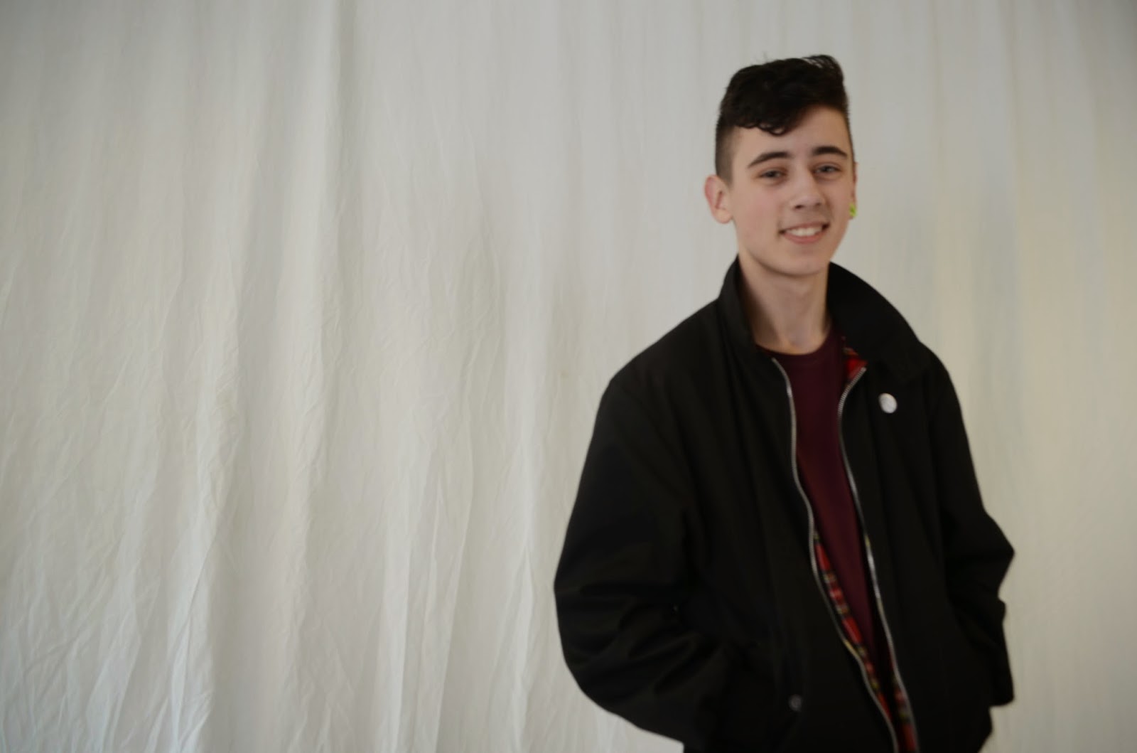
Therefore I had two photos of Amy and Cath to photoshop. Their photo-shoot was in the studio, so I had to use the magic wand tool and masks to photoshop the white sheet out of the background. This proved difficult, and probably took the longest to photoshop out of all of my photos. 


Josh 

Josh's photos were also taken in the studio. His photo was easy to edit in comparison! Here it is.


Hannah


Hannah's photo-shoot was outdoors and therefore I edited the contrast and colours of her photo. The photo didnt need that much change, just to be brightened.


Hilly DPS- smaller images

I used the burn tool as well as the hue and saturation to change the colour of the images. 
The images now stand out more.